
Appearance
Race View
Race Information Header
Information about the race is displayed at the top: the race number, race course, time off, distance, class, grade, going, race name and race description. The race status is displayed at the top right and is colour-coded for easy identification. To force a refresh of the information displayed in the race view the refresh icon can be clicked.
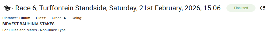
Below the information header are tabs which will display data for the race grouped by section: Runners, Markets and Statistics.
Runners
This tab shows information about the runner as well as the horse details and past form.
Runners List
This is the list of runners in the race. In addition to the names and values, columns may show a symbol, colour-coded and/or scaled so that the information and its relevance may be taken in a glance.
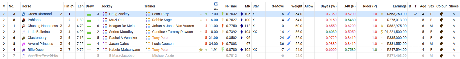
Below is a list of the columns describing the information they display as well as any symbols that may be shown.
| Column | Description |
|---|---|
| No. | Runner Saddle Number. |
| Horse |  Owner silk image, horse name and recent runs indicator. The Z symbol represents the number of runs (or lack of) that the horse has had in the last three months. The symbol is inversely scaled using unitary normalisation against the number of runs that the other runners have had. e.g. In any particular race, if the most runs a horse has had in the last three months is four and the minimum runs is zero, a horse with zero runs will have a full-sized symbol, a horse with two runs will have a medium-sized symbol and a horse with four runs will have no symbol. In another race, a horse with four runs may have a full-sized symbol if that is least runs any of the runners have had. A first-time/new-ish horse is likely to have a large symbol if running in a field with more experienced horses. |
| Fin | Finish position. This column will become visible after the race has closed and will be populated as soon as the data is available (the first four finish positions will be populated as soon as the provisional results are available). |
| Len | Lengths behind the winner. This column will become visible after the race has closed and will be populated as soon as the data is available. |
| Draw |  Starting gate draw and draw statistics indicator. The symbol shows the draw win bias in orange and the draw place bias in green. The scale of each part is calculated from the linear regression slope of the draw statistics for the race course and distance and the draw position. If there is a strong bias towards one side of the track (i.e. the slope of the regression line is steep), the symbol will be taller for the first draw on that side of the track and decrease as the draw gets further away. If there is not much bias (the slope is shallow) the symbols will start smaller and decrease further. For more information on how the draw statistics are calculated, see the Draw Statistics Chart help topic. |
| Jockey |  Jockey name and statistics indicators. The circle symbols are a representation of the statistics for the jockey and the jockey+trainer. The top left circle represents the win percentage of the jockey for the last six months. A win percentage of 25% will be shown as a full-sized circle with it getting progressively smaller as the win percentage decreases. The top right circle shows the jockey place percentage for the last six months. A place percentage of 50% will be shown as a full-sized circle. The bottom left circle represents the jockey+trainer win percentage and the bottom right circle the jockey+trainer place percentage. The thickness of the circle lines is also relevant. The line will be thinnest if the statistic was derived from less than five runs and progressing to maximum thickness if there have been more than 50 runs. e.g. if a jockey has only had one run and won on that ride, the win percentage circle will be large but the line will be thin. For more information on the jockey statistics, see the Jockey and Trainer Statistics Chart help topic. |
| Trainer |  Trainer name and statistics indicators. The circle symbols, like the jockey circle symbols, represent the statistics for the trainer and jockey+trainer. The top left circle represents the trainer's win percentage for the last six months and the top right circle the trainer's place percentage. The bottom left and right circles are the jockey+trainer win and place percentages and will be the same as shown at the bottom of the jockey cell. When a trainer has more than one runner in a race, that trainer's name will be assigned a colour and the trainer's name will highlighted in the same colour for all of the trainer's other runners. For more information on the trainer statistics, see the Jockey and Trainer Statistics Chart help topic. |
| N-Time |  Average Normalised Time and symbol. This value gives an idea of the speed of the horse and allows a comparison to the speed of other runners. It is calculated by taking the last 20 runs of the horse, then for each run calculating a unitary normalised value for the run time using the slowest and fastest times recorded for that track, distance and going. These normalised time values are then averaged to provide this value. The symbol is then scaled according to the unitary normalised value for each runner. i.e. The runner with the fastest average time will have a full-sized symbol and the slowest will have no symbol with the others scaled according to how close they are to the maximum and minimum values. The colour of the symbol indicates how many runs the average normalised time was generated from as the runner may not have had 20 runs.  >= 20 runs >= 20 runs  < 20 runs < 20 runs  < 15 runs < 15 runs  < 10 runs < 10 runs  < 5 runs < 5 runs  first run first run |
| MR |  Merit Rating and symbol. This column shows the Merit Rating value of the runner on the day as determined by the handicapper. The symbols are scaled according to unitary normalisation of the values, with the highest having a full-sized symbol and the lowest no symbol and all other values scaled accordingly. |
| Star | This is a rating given to the horse and is meant to be a finished article on the chances of each runner in the race. |
| G-Move | Previous runs grade movement. This values is intended to show whether the horse is moving up or down in grade. It is calculated by taking the Race Grade (A..G) and the last ten runs for the horse, then for each grade away from the current grade a value is added or subtracted. e.g. If the current Race is Grade B and the horse has had three runs which were Grade C, Grade D and Grade A, the value will be (-1) + (-2) + (1). So a negative value will mean that the horse is, on average, moving up in grade and a positive value means it is moving down in grade. |
| Weight |  The weight the horse will be carrying in kilograms. The feather symbol is inversely scaled using unitary normalisation. This means that the runner carrying the lowest weight will have the largest symbol and the runner with the most weight will have no symbol with all other weights scaled appropriately. This scaling takes into account any apprentice allowance. |
| Allow | The weight in kilograms the apprentice riding is allowed to deduct from the Weight. This is factored into the Weight symbol. |
| Bayes (Win) J48 (Place) Ridor (Place) | 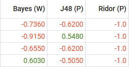 These are the predictions from various machine-learning algorithms trained using supervised learning on past results. The inputs to these algorithms have been experimentally determined to give the best chance of being correct given the available data and the predictions are updated constantly if any inputs change. Bayes (Naive Bayes) (Win): This is the chance that the Runner will win. Green indicates that it will and red that it won't. The number value is the confidence that the prediction will be correct with values between zero and one (more confident the closer to 1). If the value is negative (red), ignore the sign and the value is the confidence that the Runner will NOT win (so -0.7800 has more chance of winning than -0.9690). This value will likely only change if there is a scratching or a jockey change. Observation over two years shows this prediction to have 40% chance of being correct. J48 (Place): This is the chance that the Runner will place. Green indicates that it will and red that it won't. The value indicates the confidence of the prediction. This value may change frequently until the race starts as one of the inputs used to make the prediction is the market trend. Observation over two years shows this prediction to have 69% chance of being correct. Ridor (Place): This is the chance that the Runner will place. Green indicates that it will and red that it won't. The value will only be positive or negative 1.000. This value may change frequently until the race starts as one of the inputs used to make the prediction is the market trend. Observation over two years shows this prediction to have 72% chance of being correct. If all three are green, the Runner has a 75% chance of achieving a place. Unfortunately the average odds for this bet are 26/100 which is below the 33/100 required to break even, so don't just bet on this scenario every time it occurs. If you decide to only bet when the odds are > 33/100, the winning percentage also decreases. |
| Earnings |  The lifetime earnings of the horse. The $ symbol is scaled according to the unitary normalised earnings of the other runners. |
| B | Blinkers. Checked if the horse will be wearing blinkers. |
| T | Tongue tied. Checked if the horse will be wearing a pacifier. |
| Age | Age of the horse rounded to the nearest year. |
| Sex | Gender of the horse. C = Colt (male <= 5 years) G = Gelding (castrated male) H = Horse (uncastrated male > 5 years) F = Filly (female <= 5 years) M = Mare (female > 5 years) |
| Colour | Colour of the horse. Bay Bay  Bay/Brown Bay/Brown  Black Black  Black/Brown Black/Brown  Brown Brown  Chestnut Chestnut  Dark Brown Dark Brown  Grey Grey  Grey/Roan Grey/Roan |
| Shoes | The type of horseshoes the horse is wearing. A = Alumites a = Alumites (front only) S = Steel s = Steel (front only) L = Surgical Y = Plastic Z = Alumite bar blank = unshod |
| Open | The opening fixed odds for the runner (provided by a specific operator). |
| Close | The closing fixed odds for the runner (provided by a specific operator). This column will be only be visible after the race has closed. |
Horse Details and Past Form
Clicking on the chevron  symbol will expand or collapse the horse details and past form area for the selected runner. This shows further details about the runner such as the current owner, age, sire and dam, as well as a grid view of past runs sorted by date descending.
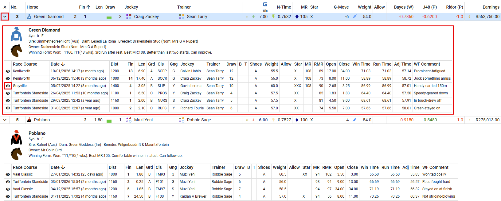
Clicking on the eye (view) icon  will drill down to that race.
Previous Runs Against Field
This graph shows a top-down representation of previous runs that horses in this field have had against each other.
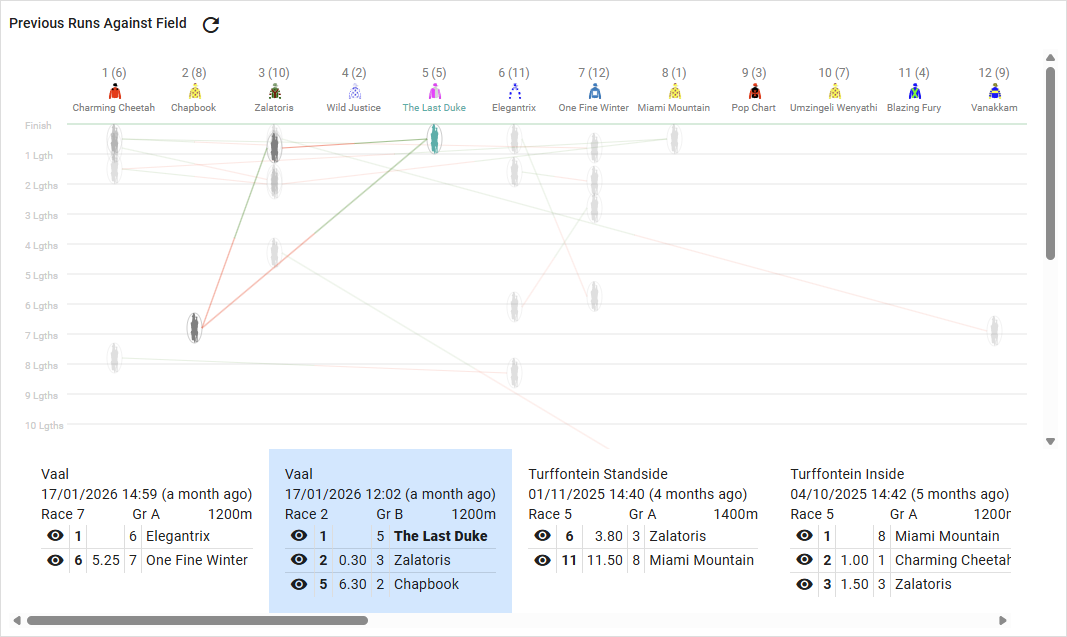
The top line is the finish line and each line below represents one length behind that. Runners that have run in the same race are displayed as a one-length ellipse and connected to the other runners in that race by lines, red if the connecting line connects to a runner that finished before it (bad) and green if the connected runner finished behind it (good). This gives a visual representation of how far ahead or behind the others a runner was.
A list of races where more than one runner in the current field has run in is laid out below the graph sorted in descending date order (most recent races first). This shows details of the race as well as a list of the current field runners that were in that race, their finish position in that race and the lengths behind the winner. Clicking on one will highlight it and the graph will grey out all other races so that the runners for that race will be highlighted. Multiple past races can be selected/deselected by clicking on them. Clicking on the eye (view) icon will drill down to that race.
Markets
This tab shows information related to the betting markets for the race. The data displayed is updated automatically on a set schedule which will increase in frequency as the start of the race approaches, but please note that there may be a delay in showing the latest value.
Current Odds
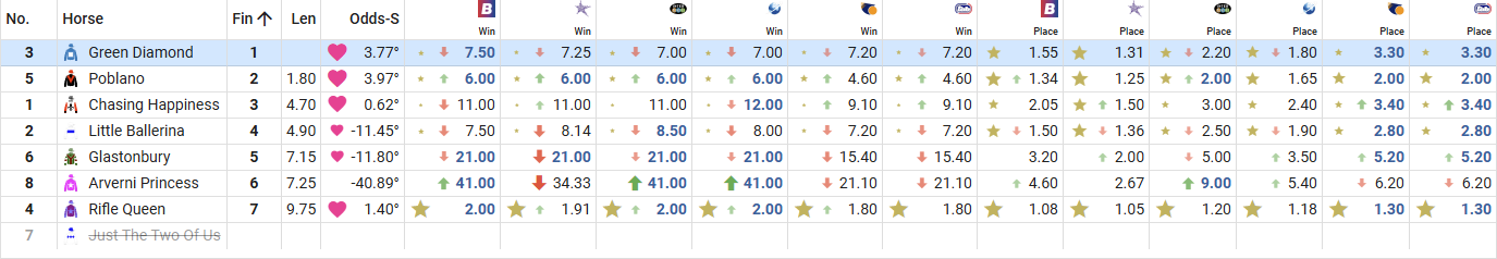
This list shows the runners for the race along with columns displaying the odds offered by a number of betting operators. The operator icon is shown in the column header as well as the text "Win/Place" to indicate the type of odds. The way the odds are displayed may be changed using the Odds Display user setting.

In addition to the latest odds value there are possibly two symbols that may appear next to the value.
The first five runners with the lowest odds (favourites) will have a gold star next to their odds. This is per column so the runner may not have a star (or a different size star) in another column showing that they may not be as favoured at another operator or a different bet type (win or place). The star is scaled according to the lowest odds by the formula odds / favourite odds so the favourite will always have a full-sized star and, if the price is double for the second favourite, it will have a half-sized star.
The red or green arrows indicate the trend (rather than last movement) of the market for that runner, bet type and operator. The scale and colour are determined by the linear regression line slope of the last ten points of the odds plotted on a chart of time vs. value. e.g. If the price is dramatically shortening, the slope will be positive and steep, so the arrow will be large and green. If the odds have slowly been getting longer, the slope will be negative and shallow, so the arrow will be small and red.
The best odds from any operator for a particular bet type are shaded dark-blue and bold. Note that for place odds different operators may pay a different number of places so the highest number may not be the best value.
| Column | Description |
|---|---|
| Odds-S |  The Love column! This is an average of all the trend slopes from all operators and all bet types for the runner. The symbol is then scaled according to the unitary normalised average trend slope values of the other runners, so the runner that has seen the most positive market movement will have the largest symbol and the the runner with the least will have no symbol. |
Odds Movement Chart
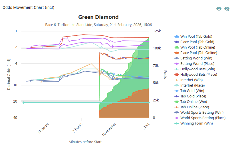
This chart plots the changes in price for a runner over time for the available betting operators and bet types.
Things to note about this chart:
- The x-axis (time) is reversed: the start of the race is on the right and the plotting will stop when the start is reached
- The x-axis is logarithmic: more detail is shown the closer to the start of the race
- The left y-axis (odds) is reversed: the lower the price, the higher the plot point (more favoured)
- The left y-axis is logarithmic: more detail is show the lower the price
- Due to the nature of logarithmic plots and the inability to plot zero or negative values, the chart will always show inclusive odds regardless of the Odds Display user setting
The chart also plots the tote win and place pools as area series, the values of which correspond to the right y-axis.
Individual series can be shown/hidden by clicking on the legend or the visibility of all changed by clicking the eye icons in the top-right corner above the chart.
Odds History List

The Odds History List shows details of the odds for each operator and the time they were recorded. The list is sorted by time descending so new changes to the odds will be inserted at the top. Clicking on an operator icon will change the filter to that operator. At the top, next to the horse silk image and name, the best win and place odds currently available are displayed next to the operator icon offering them.
Tote Payouts
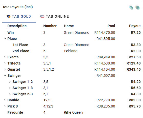
The tote payouts will be displayed when they become available.
Odds Overround
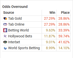
The Odds Overround list shows the percentage overround for each betting operator when all the odds are added up. This is the adjustment the bookmaker makes from what they believe are the true odds so that they can ensure a profit. See The Mathematics of Bookmaking for more information.
The lower the overround the more fair the odds are for the punter. If the overround is positive, the value will be displayed in orange if it is in the range 0-20% and red if it is above 20%. If the overround is negative, an exceptionally rare circumstance leading to a Dutch Book/coherence in which the punter can guarantee a profit, the value is shown in green (may also be mistakenly shown if the operator decides to pay less places than expected).
Statistics
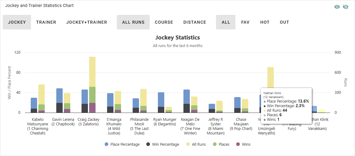
Jockey and Trainer Statistics Chart
The Jockey and Trainer Statistics Chart shows the runs, wins and places and win and place percentage for each runner for the past six months. The view can be changed to show the statistics for the Jockey, Trainer or Jockey+Trainer for each runner by clicking the buttons above the chart.
The view can be further filtered by course or distance by clicking one of the centre group of buttons. The distance filter will not just show runs for the the exact distance but for a range of distances similar to the race distance. This is so that the data groups short, medium and long distances together and is able to give a better picture.
A further filter will show All runs, Favourite runs (where the jockey/trainer was on the favourite), Hot runs (where the jockey/trainer was on one of the top three runners in the betting) and Outsider runs (where the jockey/trainer was NOT on one of the top three runners in the betting).
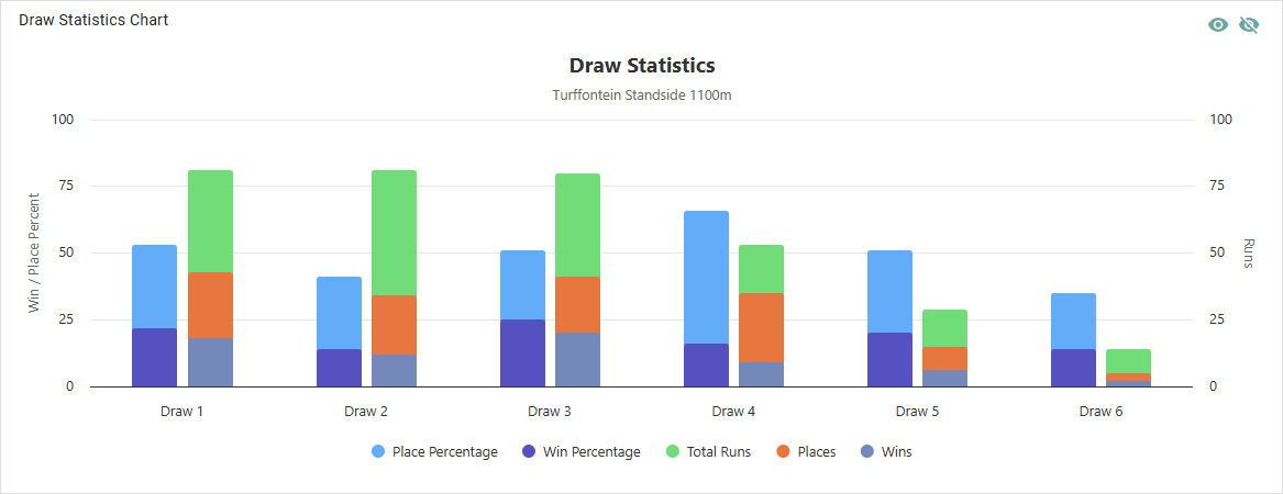
Draw Statistics Chart
The Draw Statistics chart will show the number of runs, wins and places and win and place percentage for the current race course and distance for the previous six months. Draws with less than ten runs will be excluded and the positions have been "compressed" - i.e. if a runner in draw 3 was scratched, the statistics are calculated as if all draws were shifted up.